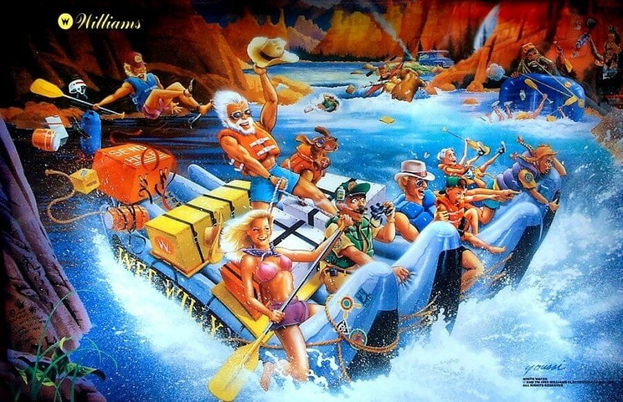
White Water
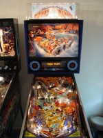
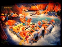
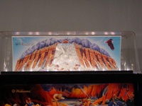
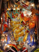
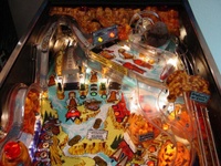
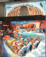
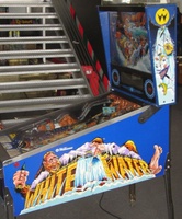
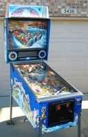
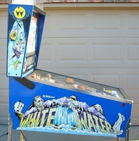
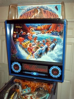
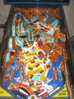
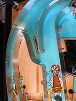
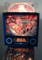
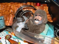
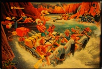
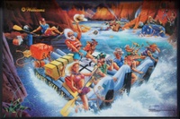
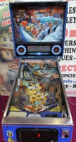
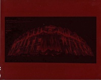
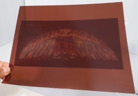
Needs to be kept clean as there are optical sensors on the outer sides of some plastic lanes, upper mini-playfield can be a bit hard to get off. Dennis Nordman said his 1952 Dodge panel truck is shown on the backglass and that Big Foot is based on his own countenance. Pictured in this listing is a "negative" image of the backbox topper and in this image we see the Williams logo is at the center and not on the left side as found in production games, as well as the absence of the eagle on the right side. John Youssi thought it might be a "film separation" but referred us to Greg Freres who conceived this topper. We asked Greg to explain this negative image and its place in the manufacture of the topper artwork. Greg replies:This is is a film "continuous tone" negative of what was probably the "color comp" that John prepared before going to the final airbrushed painting. This is not yet a film separation - that would be the next step in the process (see below). We probably experimented with the rough color piece before getting too far into the project. All of our full color work from paintings had an intermediate step in the process. After completing the full color illustration for a backglass, we sent that to our color separator and they would shoot a 8x10 color transparency, first a negative, then a positive image. That transparency was then sent back to the color separator and it would be placed on a drum scanner for scanning into their system so they could output the necessary CMYK films for either silk-screen (backglasses printed on glass) or litho printing (translites on plastic). The color adjustments were very different for these two methods of printing including size of the dot patterns, angles of the dot patterns relative to each other, and density setting when creating the films to compensate for each of the printing methods. Back when illustrators worked on illustration board, some separators would literally "peel" the top layer of illustration board off of the backing so they could roll the illustration onto a drum scanner for better color matching (think first generation). But we requested our separator NOT to peel the illustration so we could have the art intact without risk of damage. Since illustration for advertising was less "sacred" to the end user, illustrators were less finicky about the end of life for the illustration since the agency they did the work for probably didn't give the art back to the artist unless requested in the contract/agreement. So the image that we used from the transparency was more 2nd generation since the original art was scaled down to 8x10 then enlarged back to full size for the backglass (90% of pinball backglasses were painted at same size as the printed piece but some were painted larger, and reduced down to the backglass size to hold details better. One example of this for me was "Revenge From Mars" - since the backglass size was quite a bit smaller than what we did on standard pinball cabinets I made the choice to paint the illustration larger, again to hold details better.)
